A dimly lit bedroom at night with warm bedroom wall art above the bed — bed artwork designed for sleep

Fine Art · Sleep Neuroscience · Limited Edition

Bed Artwork
Designed to Help You Sleep.

Fine art prints engineered from sleep neuroscience. The last thing you see before you close your eyes — made to help you let go.

SCROLL

The Problem

Why Your Bedroom Wall Art
Might Be Keeping You Awake.

Most bedroom art is designed to look beautiful in the daytime. But you do not look at your bedroom wall art in the daytime. You look at it at night — in the final minutes before sleep, when your eyes are the most sensitive and your brain is trying to shut down.

Here is what most people do not know: the human eye contains specialized cells called ipRGCs that detect light wavelength and send signals directly to the brain's master clock. When those cells detect short-wavelength light — the blue found in most "calming" bedroom art — they suppress melatonin, the hormone that tells your body to sleep. A cool-toned abstract above your bed, even a peaceful one, is quietly telling your brain that it is morning.

This is not a metaphor. Studies from Harvard Medical School and the Lighting Research Center at Rensselaer have shown that even modest blue light exposure before bed can delay sleep onset by tens of minutes and cut total melatonin output by up to fifty percent.

The art on your bedroom wall is light. Whether it helps you sleep or keeps you awake depends entirely on what kind of light it is.

Warm · Sleep

Blue · Wake

What your eyes see at night

The Solution

Bed Artwork Built on Sleep Science: The Six Principles.

Every piece of bed artwork from The Bedroom Art is designed around six neuroscience-grounded principles. These are not aesthetic preferences — they are the visual conditions under which your parasympathetic nervous system is most likely to engage, your heart rate to slow, and your brain to transition toward sleep.

  1. 01

    Low Luminance

    The mean brightness of every piece sits in the bottom quartile of the perceivable range. No bright points to capture the gaze. Your bedroom wall art stays dark and even, the way your environment should be before sleep.

  2. 02

    Low Spatial Frequency

    Soft gradients and broad color fields instead of fine detail. If you squint at the art, nothing changes. The visual cortex finds nothing to track, and the brain begins to disengage.

  3. 03

    Warm Palette, Zero Blue Light

    Every color is restricted to the long-wavelength end of the spectrum — deep ember, dusk amber, warm charcoal. Nothing in the art triggers the melanopsin pathway. Your bedroom art reads as twilight, not as morning.

  4. 04

    Semantic Emptiness

    No faces. No horizons. No recognizable objects. No text. The viewer cannot say what the art above the bed is "of" — only what it feels like. The interpretive machinery of the brain has nothing to lock onto.

  5. 05

    Predictability

    The composition is internally coherent and easily extrapolated. Once the eye absorbs any region, it can predict the rest. No surprises. The brain's orienting response stays quiet.

  6. 06

    Stillness

    The print is fully static. Nothing in the visual field changes. Nothing demands attention. The art for your bedroom wall simply holds the space until your eyes close.

The Collection

The Collection: Art for Above the Bed.

Dusk No. 1 — bed artwork print in a dark bedroom, warm tones, above bed wall decor designed for sleep

Limited Edition of 100

Dusk No. 1

A near-black field with a slow vertical gradient from charcoal to deep ember. The eye drifts to the warmth, finds nothing to interpret, and lets go.

60 × 80 cm  ·  Pigment ink on Hahnemühle Photo Rag 308gsm
Archival: 100+ year lightfastness  ·  Matte finish, no gloss
Signed and numbered limited edition of 100

$795 — Limited Edition

Reserve This Piece →
Vesper I — calming bedroom art prints above a bed, warm tone bedroom art for sleep

Limited Edition of 100

Vesper I

A single horizon of warm amber dissolving into deep charcoal. Semantic emptiness rendered as quiet heat — the visual equivalent of a long exhale.

60 × 80 cm  ·  Pigment ink on Hahnemühle Photo Rag 308gsm
Archival: 100+ year lightfastness  ·  Matte finish, no gloss
Signed and numbered limited edition of 100

$795 — Limited Edition

Reserve This Piece →
Ember Field — large bedroom art and abstract bedroom art for the wall above the bed

Limited Edition of 100

Ember Field

Low-luminance warm charcoal wash with a single, barely-present ember at the lower third. Large bedroom art designed to recede into the room.

60 × 80 cm  ·  Pigment ink on Hahnemühle Photo Rag 308gsm
Archival: 100+ year lightfastness  ·  Matte finish, no gloss
Signed and numbered limited edition of 100

$795 — Limited Edition

Reserve This Piece →

Listeners

What Happens When You Change the Bedroom Wall Art.

I have spent thousands on my sleep setup — Eight Sleep, blackout curtains, the whole system. This print was the variable I did not know I was missing. My sleep onset time dropped by about fifteen minutes in the first week.
— Michael, San Francisco — sleep tracker user
I was skeptical. It is art on a wall. But the first night I hung it, I noticed I was not lying there thinking. I was just… looking at it, and then I was asleep.
— Sarah, Brooklyn — Oura Ring user
My bedroom finally feels like a system. The mattress, the temperature, the light, and now the wall. It all works together.
— David, Austin — architect

Essay

The Science: How Bedroom Art Affects Sleep Quality.

How Light Becomes a Sleep Signal

The relationship between bedroom wall art and sleep begins with a discovery made in 2002 at Brown University. A research team led by David Berson identified a previously unknown class of retinal cells — intrinsically photosensitive retinal ganglion cells, or ipRGCs — that contain a photopigment called melanopsin. These cells do not contribute to conscious vision. Instead, they measure the wavelength of incoming light and send that information directly to the suprachiasmatic nucleus, the brain's master circadian clock, which in turn regulates melatonin production in the pineal gland.

The ipRGCs are most sensitive to light at approximately 480 nanometers — the blue found in clear morning sky, most LED screens, and the cool-toned art that is commonly marketed as "calming" for bedrooms. When this wavelength reaches the retina, melatonin production is suppressed. The signal is involuntary and persistent: it does not matter whether the viewer intends to sleep. The photons determine the chemical response.

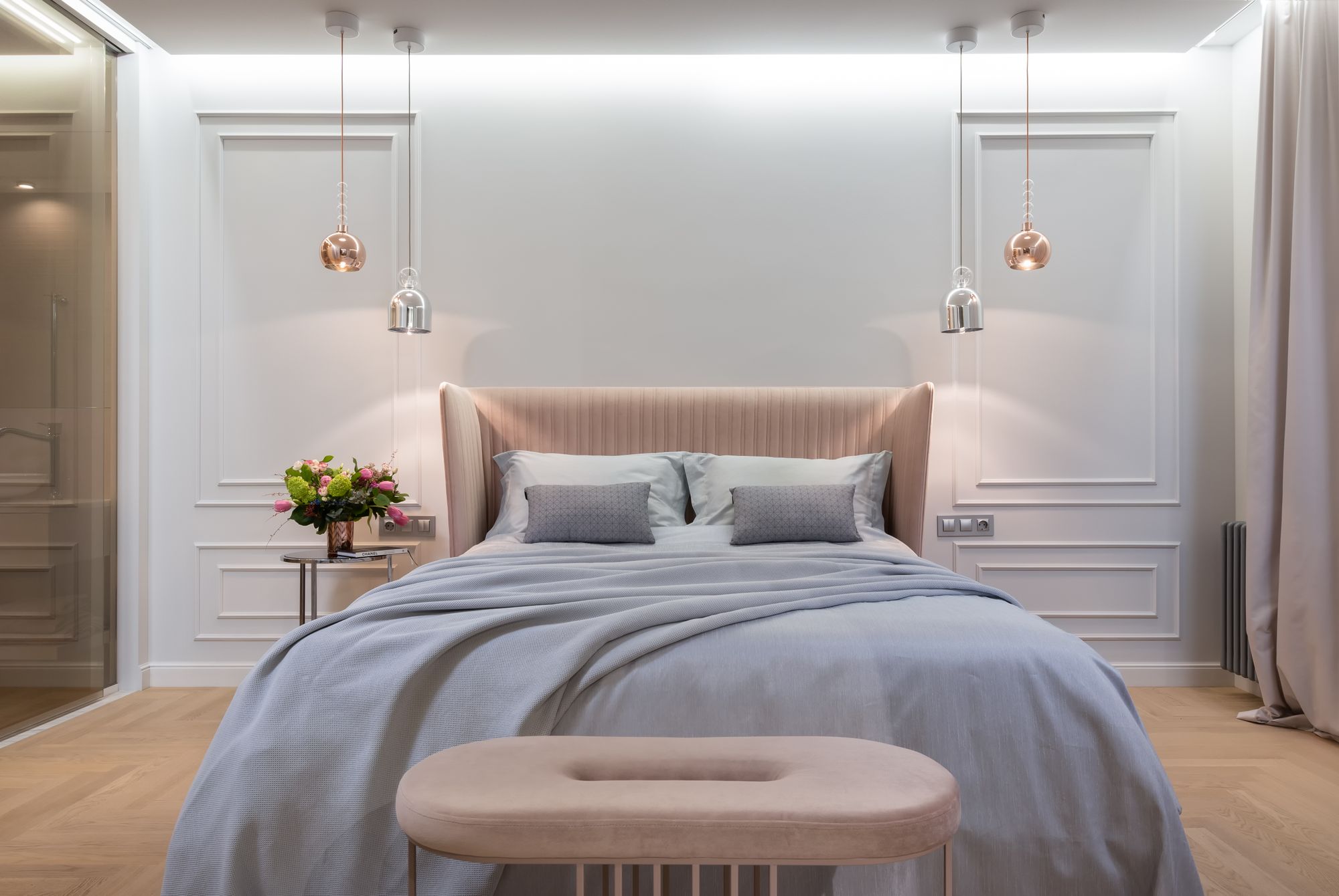
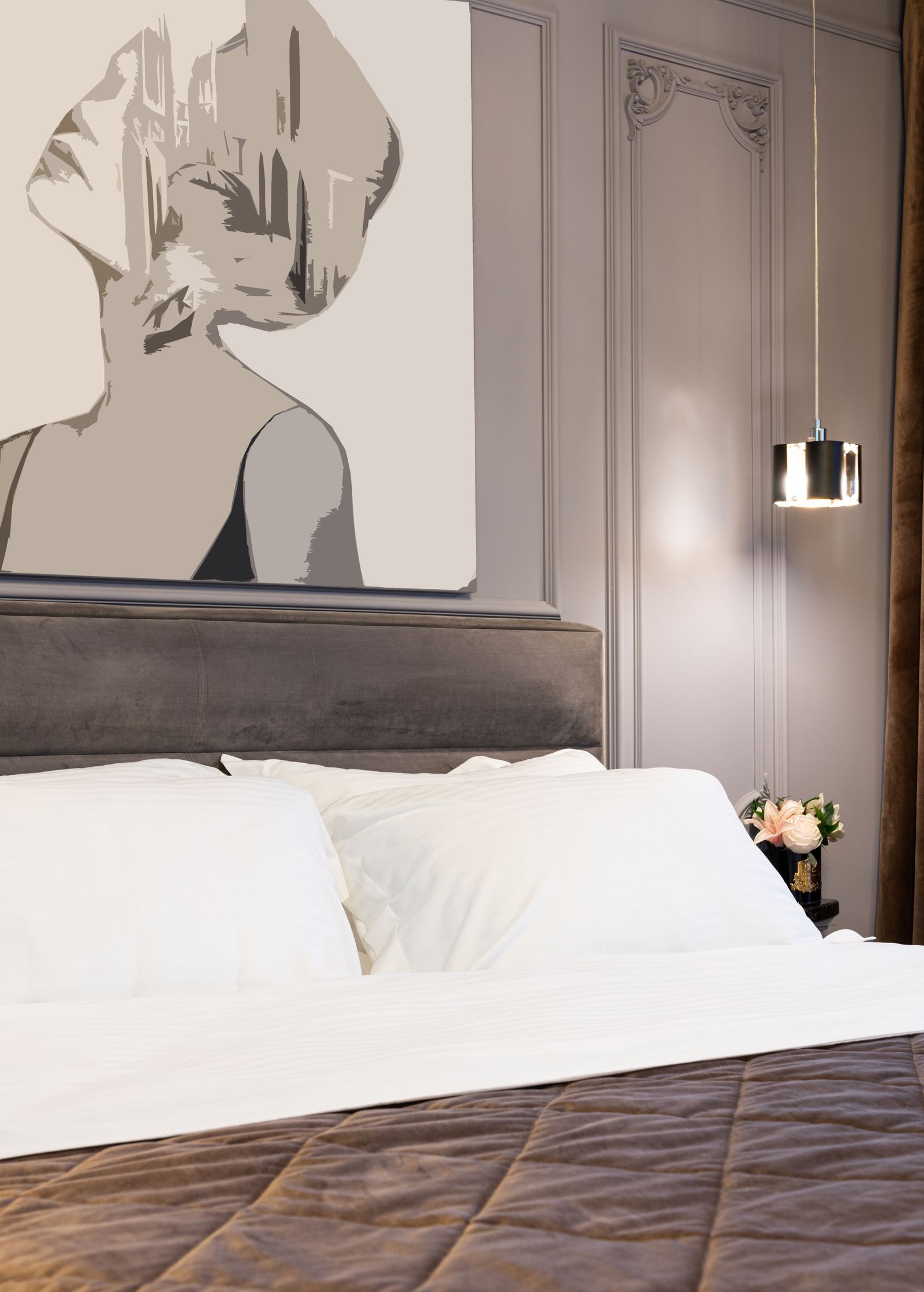
This is why the color palette of your bed artwork matters far more than its subject matter. A serene ocean landscape in cool blues may feel peaceful to your conscious mind, but to the ipRGC pathway, it registers as morning light. Warm-toned art — deep amber, charcoal, muted earth tones — permits melatonin to rise. The eye, given the right input, becomes an ally in the transition to sleep rather than an obstacle.

Why "Calming" Art Is Not the Same as Sleep Art

Beyond color, the content and structure of bedroom art matters. The brain cannot fall asleep while it is actively interpreting visual information. A painting of a forest path invites the mind to walk down it. A photograph of a coastline invites it to wonder what lies beyond the horizon. Even an abstract piece with high contrast, sharp edges, or fine texture keeps the primary visual cortex in tracking mode — the eye is involuntarily drawn to edges, and as long as the eye is tracking, the brain stays alert.

Art that genuinely supports sleep onset must be low in spatial frequency (soft gradients rather than detailed textures), low in semantic content (no recognizable objects that trigger interpretation), and predictable in structure (so the brain's orienting response, which fires at anything novel or surprising, stays quiet). These are not aesthetic choices. They are the perceptual conditions under which the parasympathetic nervous system — the body's "rest and digest" mode — is most likely to engage.

What the Research Shows

A body of research from Harvard Medical School, the University of Manchester, and the Lighting Research Center at Rensselaer Polytechnic Institute has established that short-wavelength light exposure in the hour before bed delays sleep onset and reduces melatonin output. The effects are dose-dependent: even dim warm-toned light has measurable impact. Conversely, warm-spectrum environments accelerate the body's natural wind-down process.

The practical implication for anyone choosing art for their bedroom walls is straightforward: the wall above your bed is not a neutral surface. It is a light source. Every piece of art you hang there is delivering a dose of specific wavelengths to your retina in the minutes before sleep. Choosing bed artwork with intention — selecting warm tones, low luminance, and minimal visual complexity — is one of the simplest environmental changes you can make to support better sleep.

The Craft

How It's Made: Archival Fine Art Prints for Your Bedroom.

Every piece of bedroom art from The Bedroom Art is printed on Hahnemühle Photo Rag 308gsm — a heavy, uncoated cotton rag paper used by museums and galleries worldwide. The inks are pigment-based archival inks with 100+ year lightfastness ratings.

The finish is matte — never gloss. This is a functional decision: glossy surfaces create specular highlights from any ambient room light, producing the exact kind of bright points that the art is designed to eliminate. A matte surface absorbs light. It becomes part of the dark room rather than an object in it.

Framing defaults to deep matte black — a frame that absorbs into the wall so the art feels less like an object and more like a region of darkness with subtle warmth. For the premium tier, museum-grade anti-reflective, UV-filtering glass is included.

Each limited edition print is signed, numbered, and accompanied by a certificate of authenticity on cotton rag paper and a printed Field Guide to Sleep Art — a 16-page booklet covering the science, the viewing protocol, and the care instructions.

Specifications

Paper:     Hahnemühle Photo Rag 308gsm
           100% cotton rag

Inks:      Pigment archival
           100+ year lightfastness

Finish:    Matte (no gloss — functional
           requirement)

Frame:     Matte black, deep profile
           Museum glass (premium)

Edition:   Signed and numbered
           Certificate of authenticity

Includes:  Field Guide to Sleep Art
           (16 pp., printed)

Viewing Protocol

How to View Bed Artwork for Sleep.

The art is half the system. The other half is how you view it.

  1. 01

    Hang at resting eye level

    The piece should sit at the natural angle of your gaze when reclined in bed — typically five to six feet from the floor on the wall opposite or beside the bed. You should not need to strain to see it.

  2. 02

    Dim the room

    A dim artwork in a bright room becomes a bright object. A dim artwork in a dim room becomes part of the room. Use warm bedside light below 2700K, as low as it goes.

  3. 03

    Soft gaze, not study

    Let your eyes settle on the piece without tracking or analyzing. If you notice your gaze jumping between features, allow it to defocus slightly. Out-of-focus viewing is preferable.

  4. 04

    Pair with breath

    A slow breathing pattern — four seconds in, six to eight seconds out — activates the parasympathetic nervous system. The artwork becomes the visual anchor; the breath becomes the rhythm. Together they accomplish what neither does alone.

  5. 05

    Duration

    Most viewers feel a shift within three to six minutes. The hard ceiling is around twelve minutes. After that, the piece has done its work. Close your eyes.

Questions

Frequently Asked Questions About Bedroom Art and Sleep.

  • The best art for above the bed depends on your goal. If you want to support relaxation and sleep, choose bed artwork with warm tones (amber, charcoal, earth tones), low brightness, and no recognizable objects or faces. Avoid cool blues and high-contrast designs — these can suppress melatonin production. Abstract, low-detail, warm-palette artwork is the most effective choice for a bedroom wall.

  • Yes. The human eye contains specialized cells (ipRGCs) that detect light wavelength and regulate melatonin production. Cool-toned or bright bedroom art suppresses melatonin, making it harder to fall asleep. Warm, dim, low-complexity artwork permits melatonin to rise naturally. The effect is measurable and well-documented in sleep research.

  • Blue light at approximately 480 nanometers is the strongest known suppressor of melatonin via the ipRGC pathway in the retina. Bedroom art in cool blue tones — even soft, "calming" blues — delivers this wavelength to your eyes in the minutes before sleep, delaying sleep onset. Warm-toned bedroom art avoids this effect entirely.

  • Art above the bed should be roughly 60–80% of the bed's width for balanced visual weight. For a queen bed (60 inches wide), bedroom art between 36 and 48 inches wide works well. Hang the bottom edge 6–10 inches above the headboard so the art feels connected to the bed, not floating.

  • Most calming bedroom art is designed based on how it looks. Our bed artwork is designed based on how it works — using six neuroscience-grounded principles (low luminance, warm palette, zero blue light, semantic emptiness, low spatial frequency, and predictability) to actively support the body's transition to sleep. Every piece is printed on museum-grade archival paper with 100+ year lightfastness.

  • No. Our bed artwork is designed to support relaxation and sleep onset as part of a healthy bedtime environment. It is not intended to diagnose, treat, or cure any medical condition. If you have a sleep disorder, consult a healthcare professional.

The Waiting Room

Join the Edition List.

New editions are released to the list first — often selling out before they reach the site. Join to receive early access, the science behind each piece, and essays on light, sleep, and the bedroom as a system.

No spam. One to two emails per month. Unsubscribe anytime.